Lithographs: Decorating Homes in the 19th Century
It’s easy to take for granted the reasonably-priced, high-quality art prints available today. Prior to the 20th century, our ancestors had limited options for decorating the walls of their homes, especially with color artwork. While there were paintings and, later, hand-tinted photographs, these were often one-of-a-kind pieces and hardly inexpensive.
Yet, there was another medium for producing color artwork that arose during the 1800s and that most households could afford—lithography. Publishers, like the well-known firm Currier and Ives, produced thousands of lithographic prints that hung on walls across America.
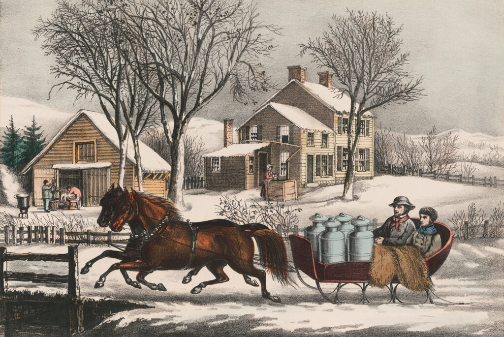
“Winter Morning in the Country” a hand-colored lithograph by Currier and Ives, 1873. Credit: Library of Congress
Past articles on this site have featured lithographs as illustrations of the time or matter being discussed. However, it was only recently that I became interested in the prints themselves and the process of lithography. This began a few months ago when my wife, Sara, and I were looking at some of the photos from our 2017 cross-country trip.
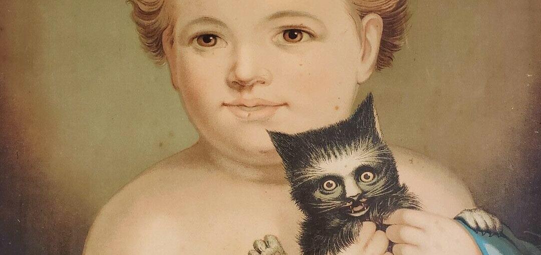
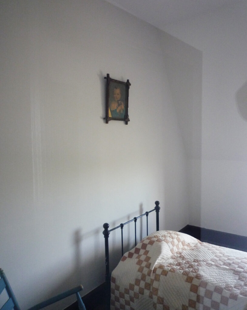
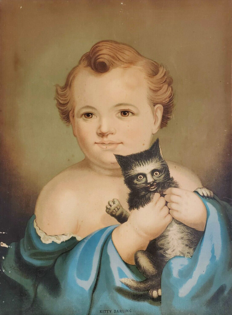
In one image, taken through a plexiglass barrier inside the Burt House at Fort Laramie in Wyoming, we spied an odd picture of a child squeezing a scared cat. It looked like some type of lithographic print, and we wanted to know more. After hours of fruitless online searching, we contacted the National Park Service in hopes they could fill in more details. We reached Christopher Mather, Cultural Resource Program Manger at Fort Laramie, who said he would investigate further and let us know.
In the meantime, Sara and I decided to learn more about the process of lithography, which comes from the Greek for “stone writing.” Creating a lithograph begins with slab of smooth limestone. An artist draws upon this using a grease pen or wax crayon. The sketch must be a mirror image of the final design so it appears correctly when printed.
With the picture on the stone finished, a mixture of Gum Arabic and acid is applied over it, etching the areas of the stone that haven’t been drawn on. Excess grease is then removed using a specialized turpentine and the stone is wetted. The drawn areas remain slightly greasy to repel water and accept ink, while the sections without drawing accept water which repels ink. Ink is rolled onto the stone, and a sheet of paper is laid upon this and pressed. The ink is transferred from the stone to the paper, creating the printed image.
Lithography was invented in 1796 and peaked in popularity during the latter half of the 1800s. Initially, publishers sold prints that were simply black-and-white sketches made from a single stone. Sometimes a second or third stone was added to layer tonal effects onto the black-and-white lines and provide prints with more dimension. This process was known as tinted lithography. Many publishers, like Currier and Ives, created black-and-white lithographic prints that were colored by teams of young workers who hand-painted each image.
Other publishers utilized the more advanced process of chromolithography. Similar to tinted lithographs, chromolithographs required designing a stone for each color in an illustration. Sometimes as many as 20 stones were used! The final print was built up by precisely printing one color after another onto the same piece of paper.
Chromolithographs were more costly to produce than hand-colored lithographs. However, the results were appealing to consumers of the late 19th-century, who wanted to decorate their homes with colorful, high-quality artwork. Chromolithography fell out of favor in the 20th century as it was replaced by the modern offset printing process.
Our ancestors certainly owned and decorated their homes with lithographs. In speaking with my father, Mark, about prints owned by family members, he was able to produce two that hung in the home of Harold Sechler (b. 1923) and likely came from Harold’s aunt, Grace (Sechler) Cromis (b. 1882). The first was a hand-colored lithograph titled The Tree of Life. The Christian. and was published by Nathaniel Currier between 1835 and 1856. The second was a chromolithograph titled The Words and Works of Our Savior and was published in the 1890s. Instead of being purely decorative, the two prints also taught a religious lesson.
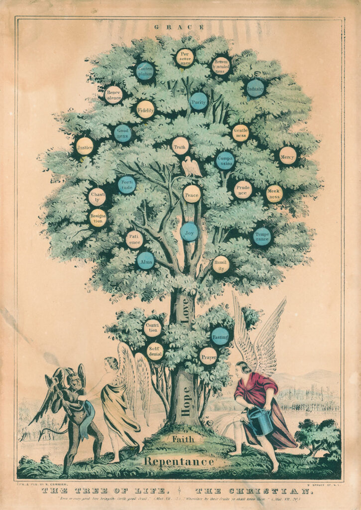
“The Tree of Life. The Christian.” a hand-colored lithograph by Nathaniel Currier made between 1835–1856. Credit: Library of Congress
About a week after contacting the National Park Service, Sara and I received a reply from Christopher Mather. He provided a copy of the furnishing plan for the Burt House, which had been written by curator Sally A. Johnson in 1961. She used a number of historical sources to develop a plan for decorating the building, including the recollections of Brigadier General Reynolds J. Burt. Burt lived in the house as a boy, and coincidentally, the room where the cat picture hung was his childhood bedroom. Unfortunately, neither the furnishing plan nor Burt’s recollections mentioned the name of the image that hung over the bed.
Thankfully, Mather provided something else. He had carefully inspected the artwork and noticed it was a chromolithograph published by E.P. and L. Restein of Philadelphia in 1872. He also noticed the title of the piece was printed at the bottom of the work: Kitty Darling. Lastly, he provided a link to an original copy of the chromolithograph for sale on eBay.
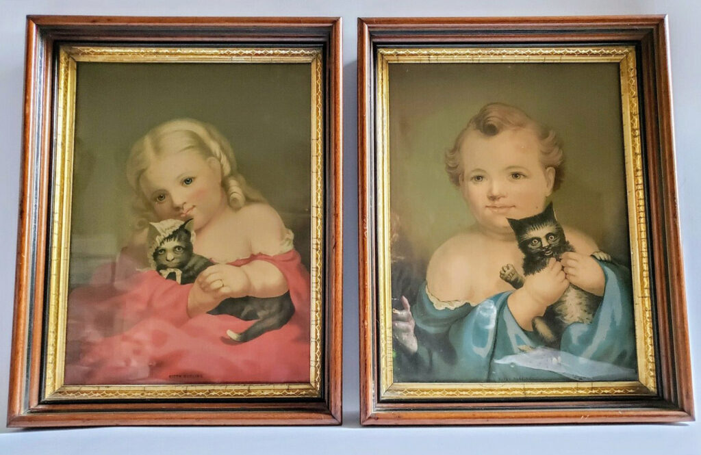
When Sara and I reviewed the eBay listing, we were surprised to see that the picture we had first seen was actually one half of a pair of prints, both of which were titled Kitty Darling. One showed the cat with a girl and the other depicted the cat with a boy. Amazingly, they were in their original, late 19th-century frames too.
We purchased the two pictures immediately and, upon receipt, hung them in a prominent location. It was a perfect conclusion to what had been a journey through history, family, and ephemera. Along the way, we learned about the development of lithography, the chromolithographic printing process, and artwork once owned by our Sechler relatives. All of this stemmed from a tourist snapshot taken at Fort Laramie in 2017.







Excellent ! The strange ( weird??) cat story ! So interesting . For all of us who love cats and love a good cat story . Thank you , Andrew and Sara
thanks Andrew… good article… good subject… always a good story when there’s a cat in it!!
Thanks, Aunt Barb and Uncle Dave! Just goes to show that cats (and art) have always been a little weird 🙂
cats aren’t weird.. the people that own them are!!
Interesting also that the facial expressions are so serene, as if the subjects were looking out on a world with no problems or dangers. Yet life expectancy in the 19th century was rather brief.
Thank you for your detective work on “Kitty Darling.” I have a framed copy of the boy with cat chromolithograph that you saw first, but did not know the name of the publisher. It’s nice to know more about my print.
I have one too bought in pittsboro North Carolina years ago in a junk store. I love it! Do you have any idea of it’s worth? It’s in the original frame!!!